HUYGENS
The Problem
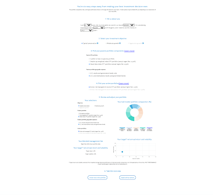
Huygens Capital is a digital investment advisor, providing investment services to high net worth individual investors seeking hedge-fund level sophistication and risk management at robo-advisor level pricing. Located in New York City, Huygens Capital’s mission is to provide differentiated strategies and peace of mind to their clients. Huygen Capital came to us with a great product with a significant barrier to scale: their website. They feared that, in its then-current state, it would deter potential clients who had little expertise in finance or investing.
-
Modernize the Huygen’s Capital website UI/aesthetic and simplify the user experience to translate the trustworthiness, credibility, and value Huygen’s Capital brings to potential clients.
-
Ariel Rivkin, Cassie Vidal, Luke Bateman, Sebastian B.
-
3 weeks.
PAIN POINTS
-
The original version of Huygen’s Capital site provided the user with advanced financial terms. The jargon used on the site was lost on a population that generally felt themselves to be ‘novice’’s to investing. The mismatch of the sites language and the target audience led to an overwhelmingly confusing experience for the user. The terms were too advanced to effectively communicate the high value and positive impact Huygen’s Capital and robo-advising offered investors, especially prospectively new investors.
Stat: we learned that 88.6% of our testing population was new to robo-advising.
-
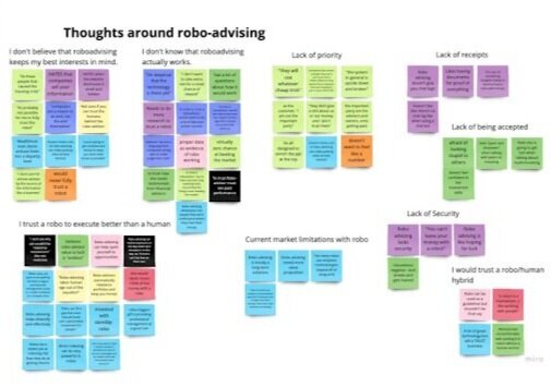
Overall, our testing population expressed a general lack of trust in the service. On one level, there was a shared sentiment of distrust and unfamiliarity with the concept of a robo investing advisors efficacy. On a second level, the site’s unintuitive presentation and experience contributed to people questioning the credibility and trustworthiness of Huygen Capital’s service and offerings.
-
Users missed the human element that was excluded from the utilization of a robo-advisor. Many described the process as “impersonal” service devoid of human interaction/connection. and expressed doubt that an algorithm could better consider investors’ best interests and personal needs better than the abilities of another human. Many within the target audience of Huygen’s generally felt the need of a human element to be embedded within matters of personal finance.
-
Attributes such as unfamiliar financial terminology, undesired redirection to other complicated pages, overwhelming amount of information, cramped spacing, “bland” and unprofessional aesthetic culminated in a frustrating user experience. The site’s presentation was in need of a few tweaks.


Design Exercises
After identifying these pain points we used several design thinking exercises to align our dispersed team on the goal. To do this, we used Figma and Miro to capture our thought processes and activities from a series of Zoom-hosted video conferences.
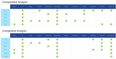
Competitive & Comparative Analysis - used to identify opportunities Huygens could capitalize on by noting the gaps of its competitors
Surveys - to find behaviors, thoughts, and feelings around investing and robo advising
User Interviews - to gain insight around users experiences and feelings towards investing/robo-advising
Usability Testing -to understand user perceptions around the then-current Huygens website. The aim being to discover frustrations and/or misunderstandings
Site maps - to visually organize the sites pages and to understand the way users will interact with the site
User flows - to understand the delta between the current user flow and the ideal user flow. Will direct users through the most efficient path to success on the HUygen’s website. Provides a top level understanding of the navigational hierarchy
Personas / Affinity Mapping - to synthesize and humanize the qualitative data insights gathered from user research
Journey mapping - to contextualize the users thoughts, emotions as they journey through their use of the website
BRAND REFRESH
We took the trends and findings from our user research and made appropriate recommendations. We also took our work one step further and constructed a web redesign package for Huygen’s Capital. Every choice that went into the redesign package was made with the thought to improve the sites usability and thus increase the interaction between the site and potential customers. Given our time constraints the redesigned aspects were to be replicable and easy to transfer to other platforms or web pages.
Style guide - to maintain visual consistency throughout Huygen’s Capital website and to ease the process of replication in future iterations or marketing materials.
Low-fidelity composites - to use in usability testing to test out efficacy and feasibility of ideas/ sketches.
Usability tests - to observe how users make out with low stakes ideas/sketches and to find any changes needed to improve the composite before moving forward.
Prototype - the result of learnings and insights from multiple rounds of sketches and usability testing.
A/B Tests - to compare two different variations of the same page and understand which variations provides a better response from users.
Redesigned User Experience
RESULTS
First and foremost, our primary goal was to create a more impactful user experience. In just a few weeks we were able to provide a wealth of user data, analysis, and synthesis to inform a potential brand direction for Huygen’s.
Given more time and resources our team would run additional iterations in research, ideation, and usability testing and build out a full web experience. With more iterations we could flush out every improved flow or perfect UI. An example of an additional methodology we would include was empathy mapping. Considering the time and scope constraints of the project, the reception of our client was extremely positive. In their eyes, we exceeded expectations and delivered successfully.


